Role
Associate Creative Director
Contribution
UX/UI Lead
Art Direction
Product
Public-Sector Healthcare Platform
Users
California residents seeking health. They include low- to middle-income individuals and families, pregnant people, seniors, gig workers, college students, mixed-status households, and anonymous users exploring plans—many with diverse language, accessibility, and digital literacy needs.
Client


The Challenge
The Plan Comparison and Plan Shopping experience within California’s state health portal had become outdated, difficult to navigate, and misaligned with the needs of its diverse user base. Users struggled to understand their coverage options, eligibility, and enrollment steps, especially those in mixed-status households or with limited health literacy.
The platform’s design suffered from confusing flows, limited accessibility, and inconsistent support for complex real-world scenarios. Our team was brought in to lead a full reimagine of the consumer experience, improving clarity, accessibility, and plan selection outcomes within a fixed 6-month timeline and a legacy development environment.
Task
As Creative Director and UX/UI Lead, I was responsible for driving the end-to-end redesign of the plan shopping and enrollment experience across multiple user flows and system interfaces. The goal was to deliver a more intuitive, accessible, and scalable solution that could meet the needs of diverse Californians, while aligning design delivery with a legacy, waterfall-based development process under tight deadlines.
Key responsibilities included:
- Overseeing the redesign of consumer flows, admin dashboards, enroller dashboards, household grouping, and issuer portal
- Providing creative direction, design oversight, and mentorship for a distributed team of four designers
- Establishing scalable design systems and component libraries to support 1-week sprint cycles
- Ensuring accessibility compliance from design through QA
- Managing cross-functional alignment with product owners, developers, and policy stakeholders
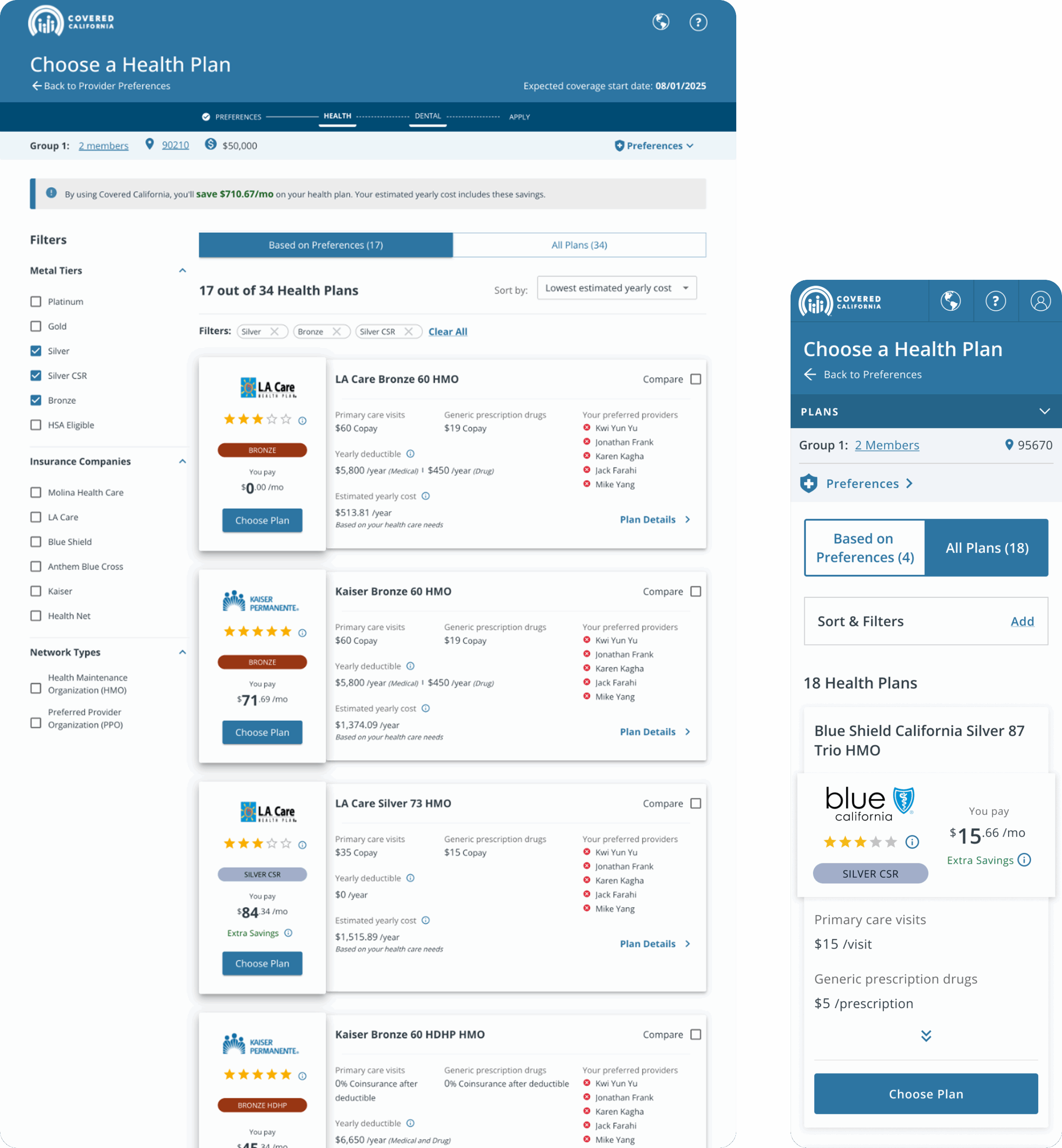
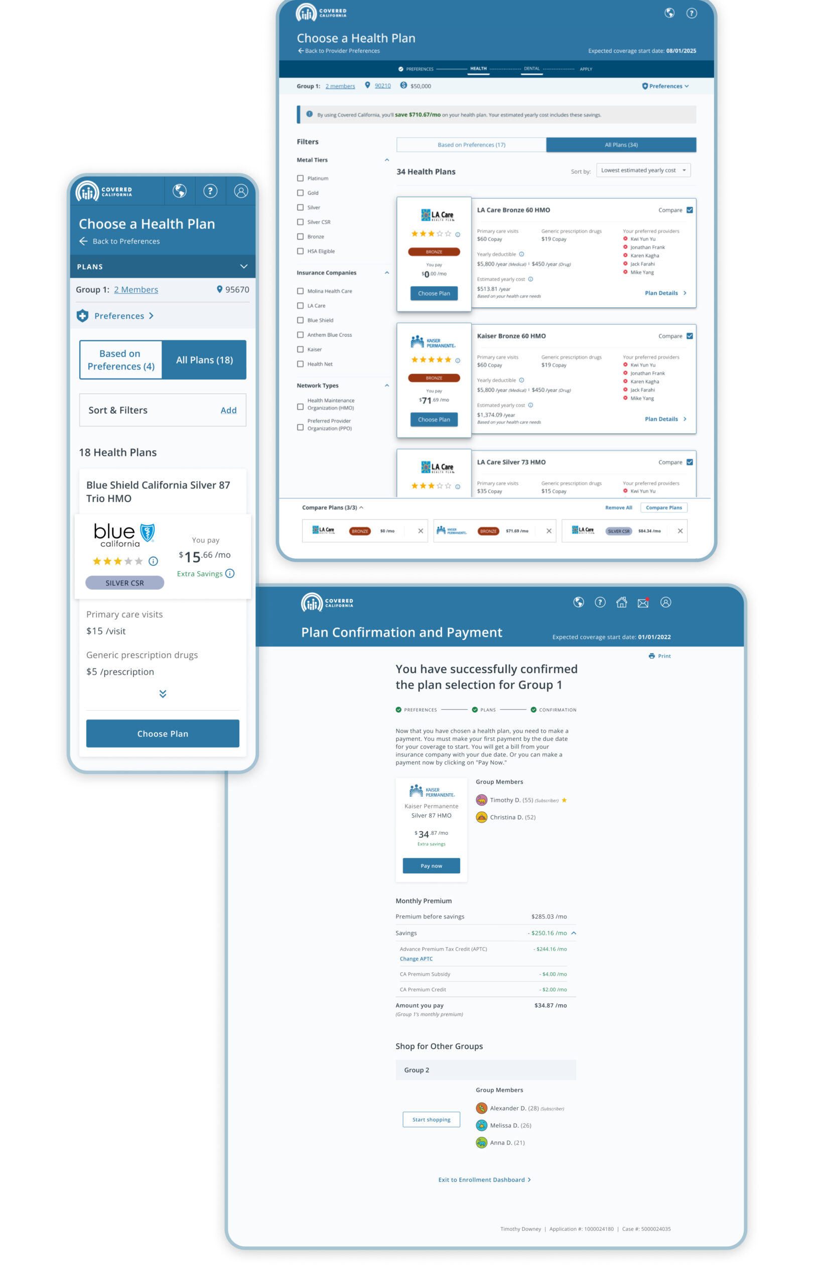
Before & After


Slide left and right to see the before and after

Action
To transform the experience, I led a user-centered redesign grounded in research, accessibility best practices, and scalable systems thinking. I balanced stakeholder input with UX strategy, modernized the visual and interaction design, and established operational efficiencies to help the design team move quickly and consistently within agile sprints, despite a waterfall-aligned development timeline.
Key actions included:
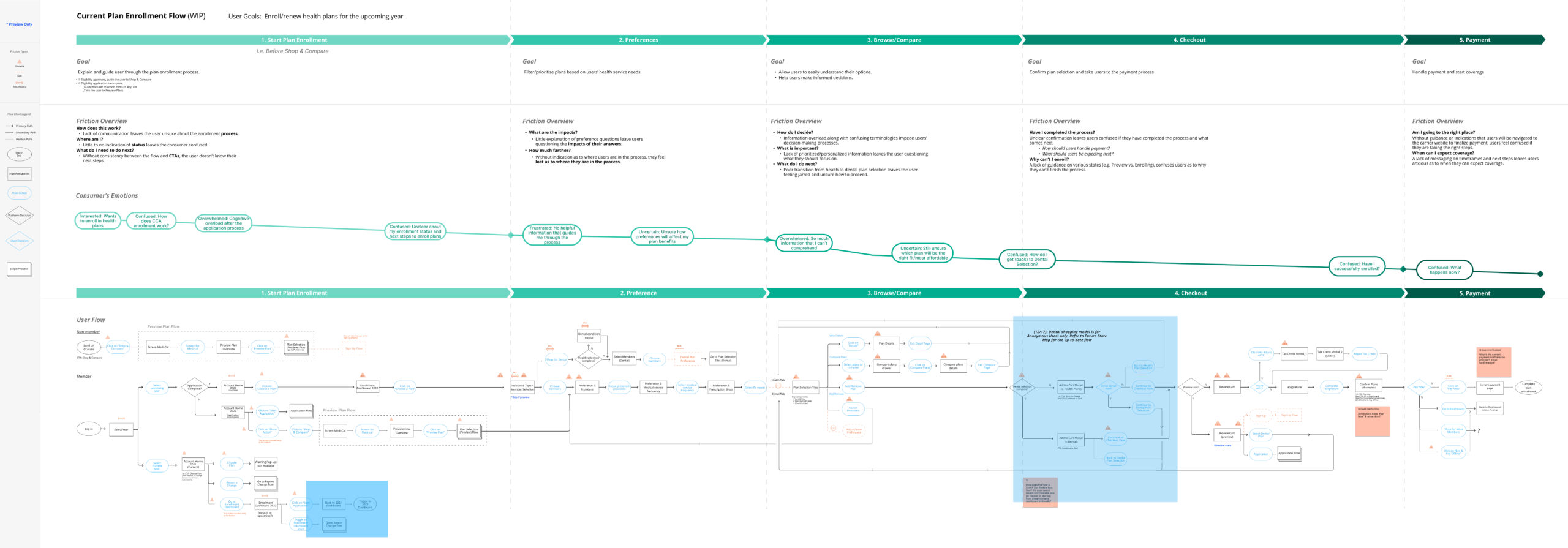
- Lead UX team conducting heuristic evaluations, competitive analysis, and moderated usability testing with diverse user groups
- Lead UX effort to Improve user flows, plan comparison clarity, visual hierarchy, and content prioritization
- Simplified the checkout process and created tailored pathways for logged-in, anonymous, and complex household users
- Embedded accessibility into every sprint, including contrast fixes, design QA, and WCAG-compliant handoff
- Created a central Figma component library to ensure consistency and speed across four designers
- Navigated cross-functional collaboration with product owners, policy leads, and overseas development teams
- Coached senior UX designers and unblocked junior designers, while diplomatically guiding stakeholder feedback toward user-centered decisions


Result
The redesigned experience made meaningful strides in improving clarity, accessibility, and team efficiency. While formal analytics were limited, stakeholder feedback and internal testing indicated strong early signals of success and long-term design value.
Key outcomes included:
- Improved plan selection clarity and reduced user confusion, especially for mixed-status households and anonymous users
- Positive stakeholder feedback on the visual hierarchy, simplified flows, and support for real-world scenarios
- Addressed key accessibility issues, including contrast, focus states, and screen reader compatibility
- Established a reusable component library, helping our 4-designer team work faster and stay aligned in 1-week sprints
- Improved cross-functional communication between design, product, and development, even across agile/waterfall misalignment
Reflection
This project was a masterclass in leading through ambiguity and constraints. I navigated legacy systems, aggressive timelines, and varied stakeholder expectations, without compromising user experience or accessibility.
If I were to approach it again, I would advocate even more strongly for extended usability testing and realistic sprint planning aligned to user-centered goals. Still, this work set a new bar for the platform and showcased how creative direction, design ops, and accessibility can transform critical public-facing systems.
Contact me
© Zeinab Mohtadi 2025 | Digital Product designer, UX/UI
Email: zmohtadi@gmail.com
Linked In: in/zmohtadi
Dribbble: dribbble.com/zmohtadi
