

Role
- UI Designer
- Brand Designer
Contribution
- Brand Identity
- UX/UI Design
- User Research
Users
- Active-duty service members, and their family
- National Guard and Reserve members
- Veterans
- Deployment leaders and relocation officers
- Military support staff and counselors
- Base commanders and installation staff
Client
- US Department of Defense
The Challenge
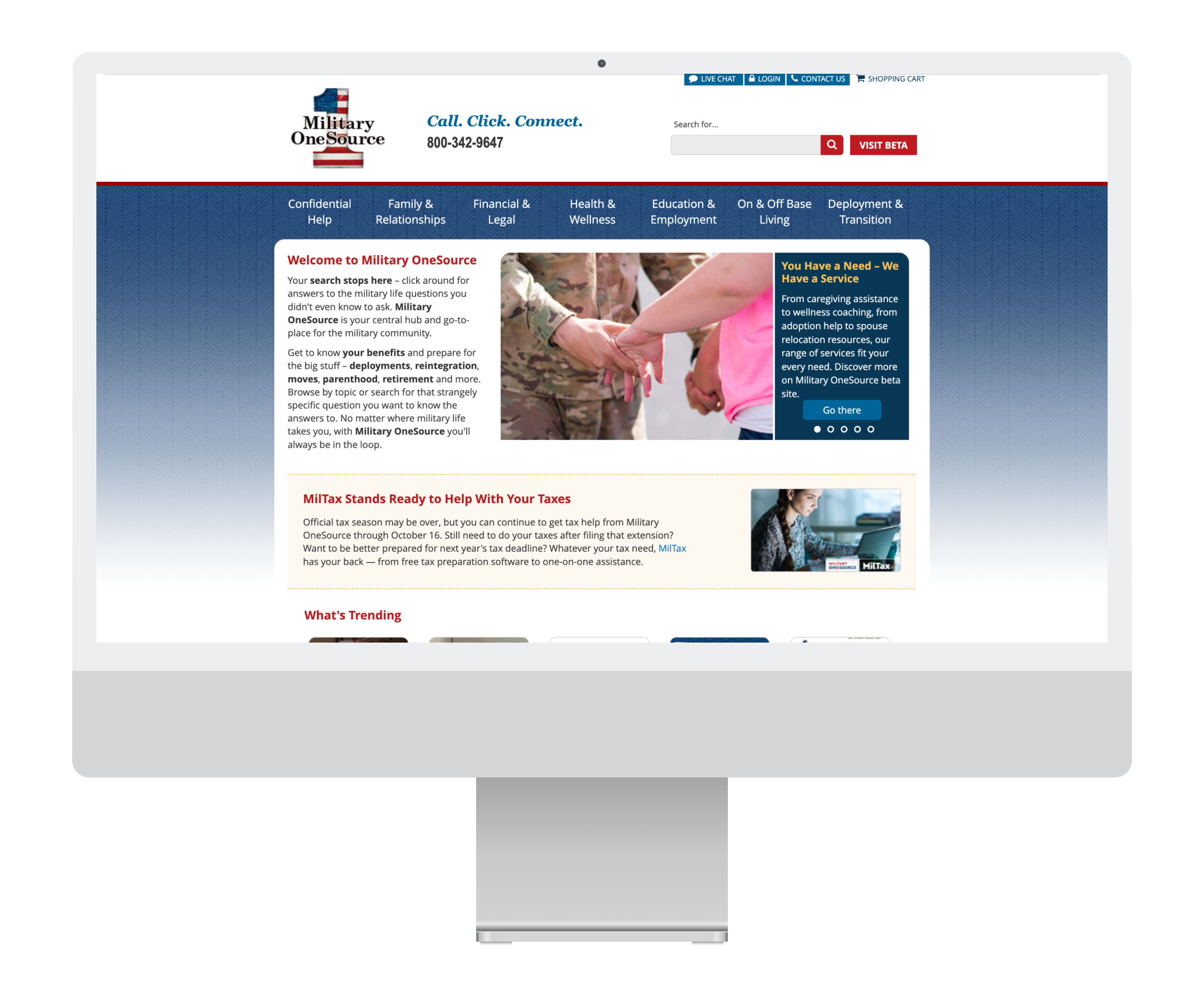
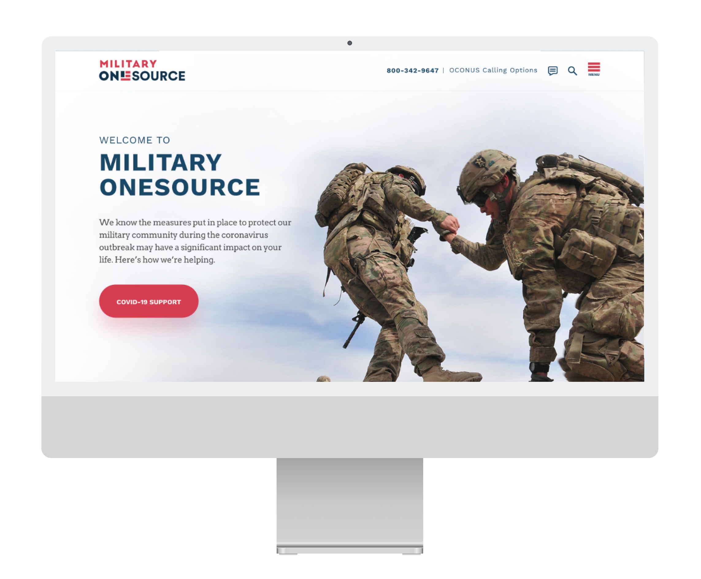
Military OneSource (MOS) is the Department of Defense’s central support program for active-duty service members, families, and transitioning veterans. For service members and their families, navigating military life means constant change, deployments, relocations, new schools, and shifting benefits. Military OneSource (MOS) was meant to be the 24/7 gateway to help. Yet despite offering everything from relocation support to tax filing to wellness coaching, MOS was mostly known for just one service: confidential counseling.
The problem was clear. The website hadn’t been modernized since the early 2000s. Its branding was outdated, the content sprawling and unorganized, with difficult navigation. Families often turned to Facebook groups or word of mouth to find answers, especially during relocation.
The DoD asked our team to reimagine Military OneSource. The goal was to rebrand Military OneSource and redesign the full experience to reflect what it really is: a one-stop, trustworthy and reliable resource for military personnel and their families.
Task
As one of three designers on a full product team, I was responsible for:
- Leading brand identity exploration and delivering a final brand system
- Designing the UX/UI for the core website and two key digital tools (Plan My Move and Plan My Deployment)
- Supporting user research across 100+ interviews worldwide (CONUS and OCONUS)
- Partnering with PMs, engineers, accessibility experts, and DoD stakeholders to bring the new MOS ecosystem to life
The goal was to create a platform that service members and families would not only use, but trust.
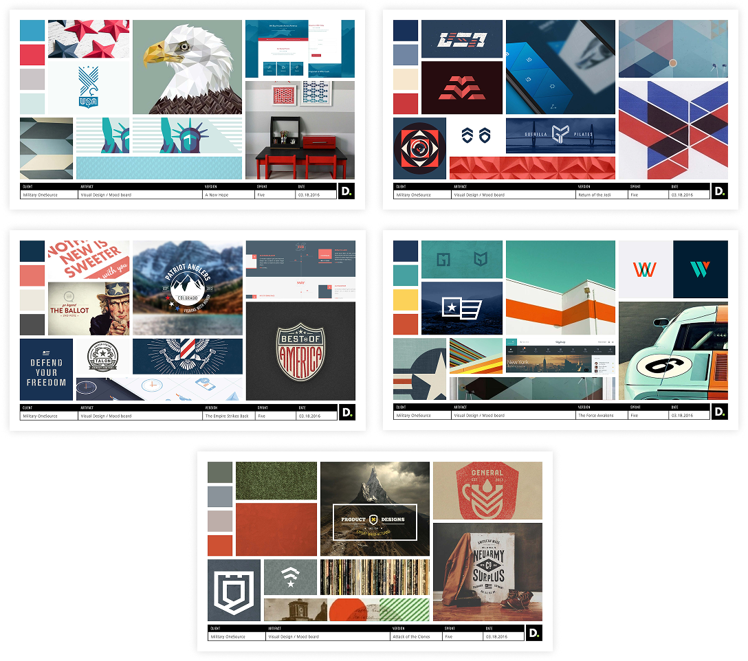
Moodboards
Brand Colors

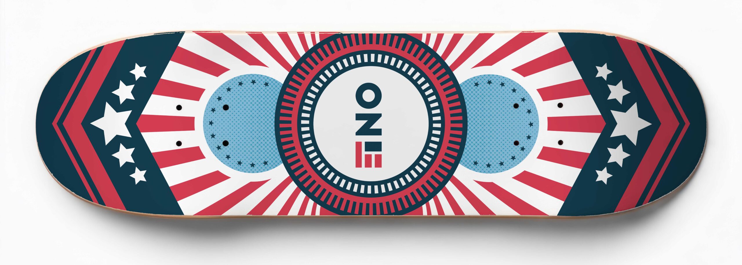
Final Logo
To stay responsive, we also launched a beta version of the new site with built-in feedback tools. Users could tell us what worked, what was missing, and what could be better. We used that input to refine the final version.
Throughout, I collaborated daily with engineers, product managers, accessibility experts, and our creative director. I contributed to the component library, iterated on layouts, and helped guide implementation from wireframes to final handoff.
Logo
Action
We started with research, listening to over 100 service members, spouses, and veterans across branches, ranks, and regions. We learned that while MOS offered invaluable services, users didn’t know they existed or couldn’t find them when they needed them most. The stress of a move or deployment was already overwhelming; the digital experience needed to simplify, not complicate.
At the same time, we ran brand workshops with the stakeholders. Each designer presented a full identity system, and ultimately, my concept was chosen. It conveyed strength, trust, and simplicity: patriotic without cliché, supportive without being clinical.
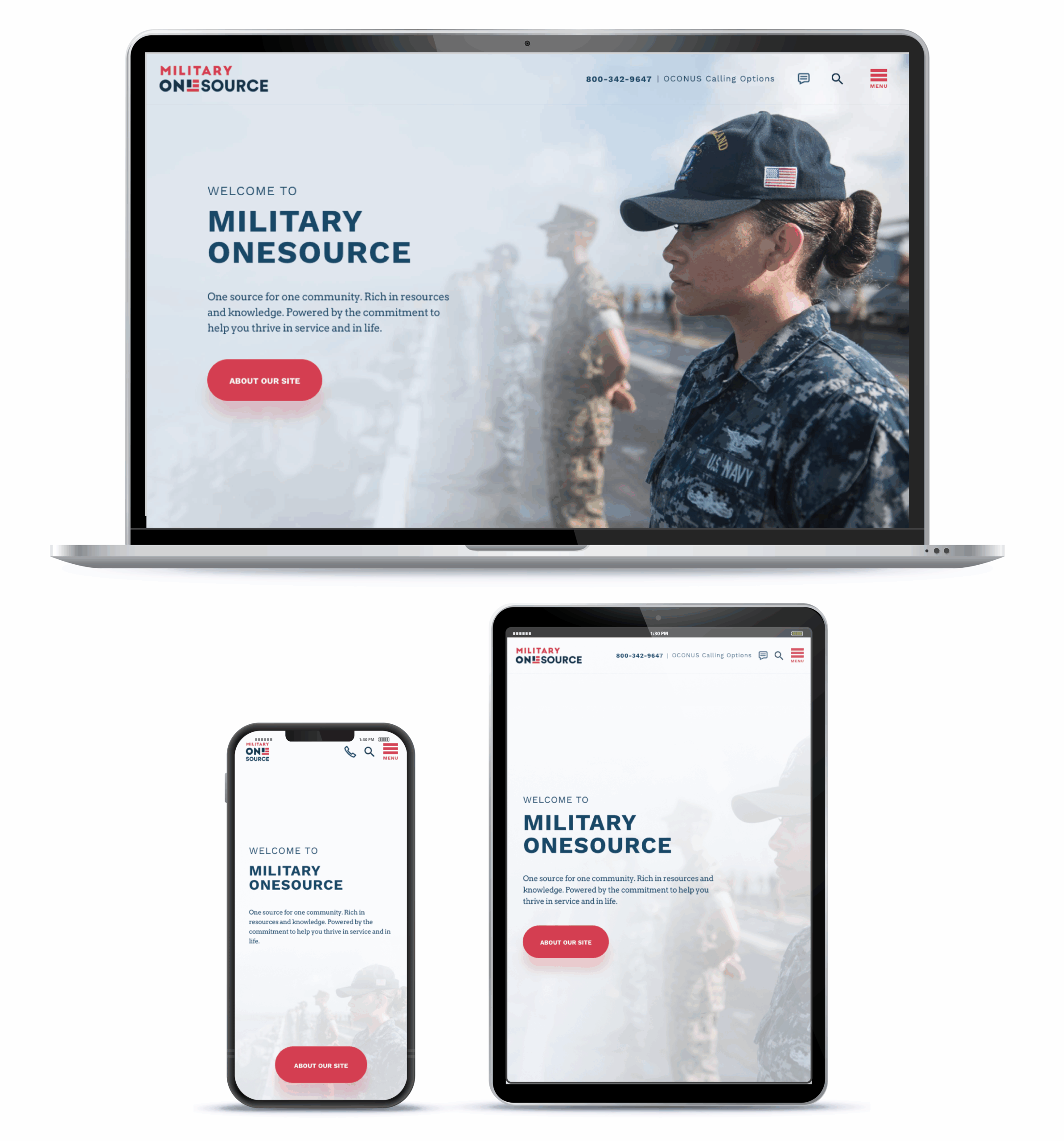
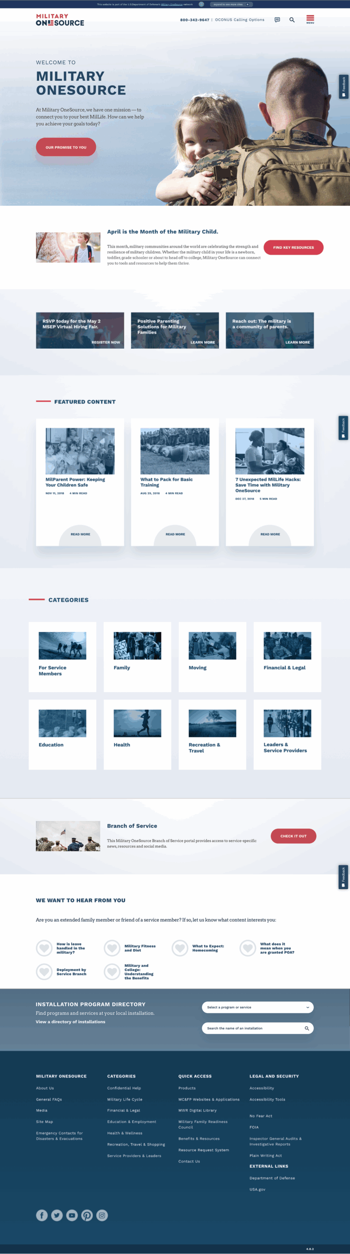
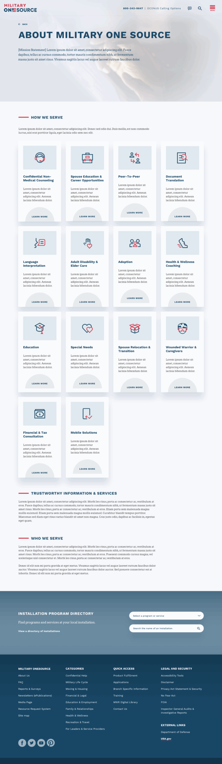
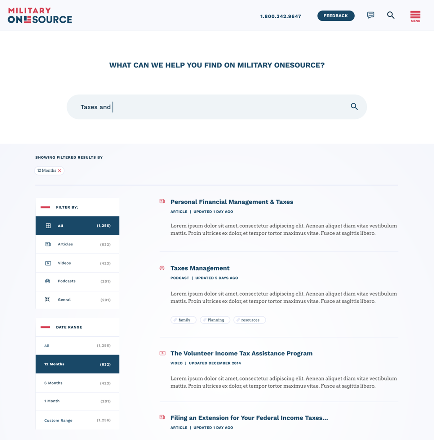
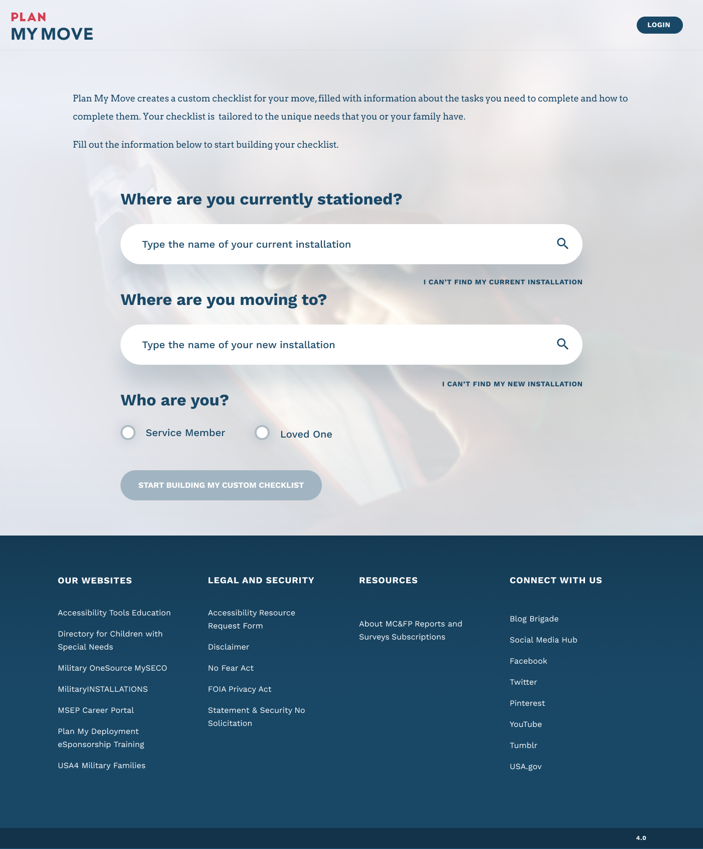
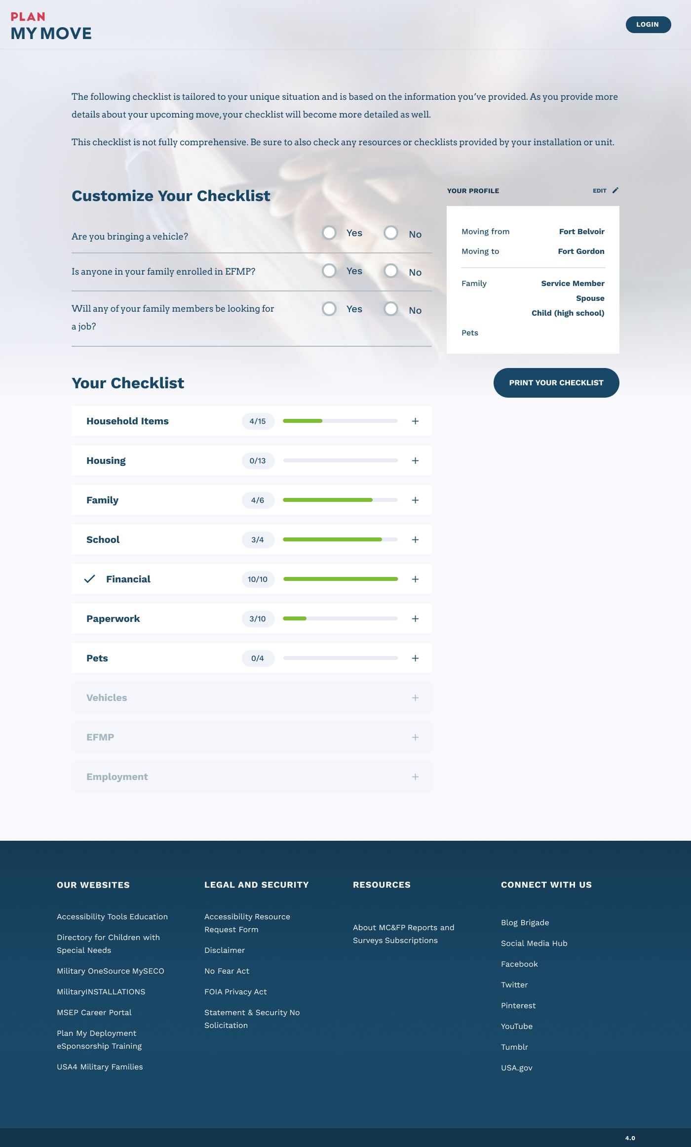
With the brand set, we tackled the website. Together, we distilled over 20,000 pages of scattered content into ~2,000 clear, actionable pages. The new site gave users a modern, device responsive experience that was accessible, structured, and easy to navigate.
Alongside the website, we designed two new digital tools:
Plan My Move: A personalized checklist and resource hub for relocations, connecting families to housing, schools, movers, and installation info in one place.
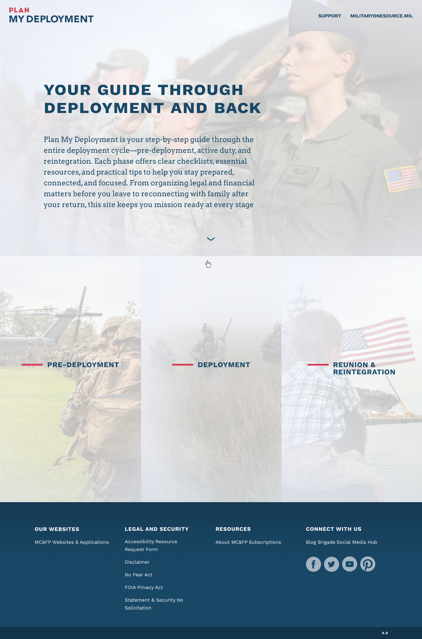
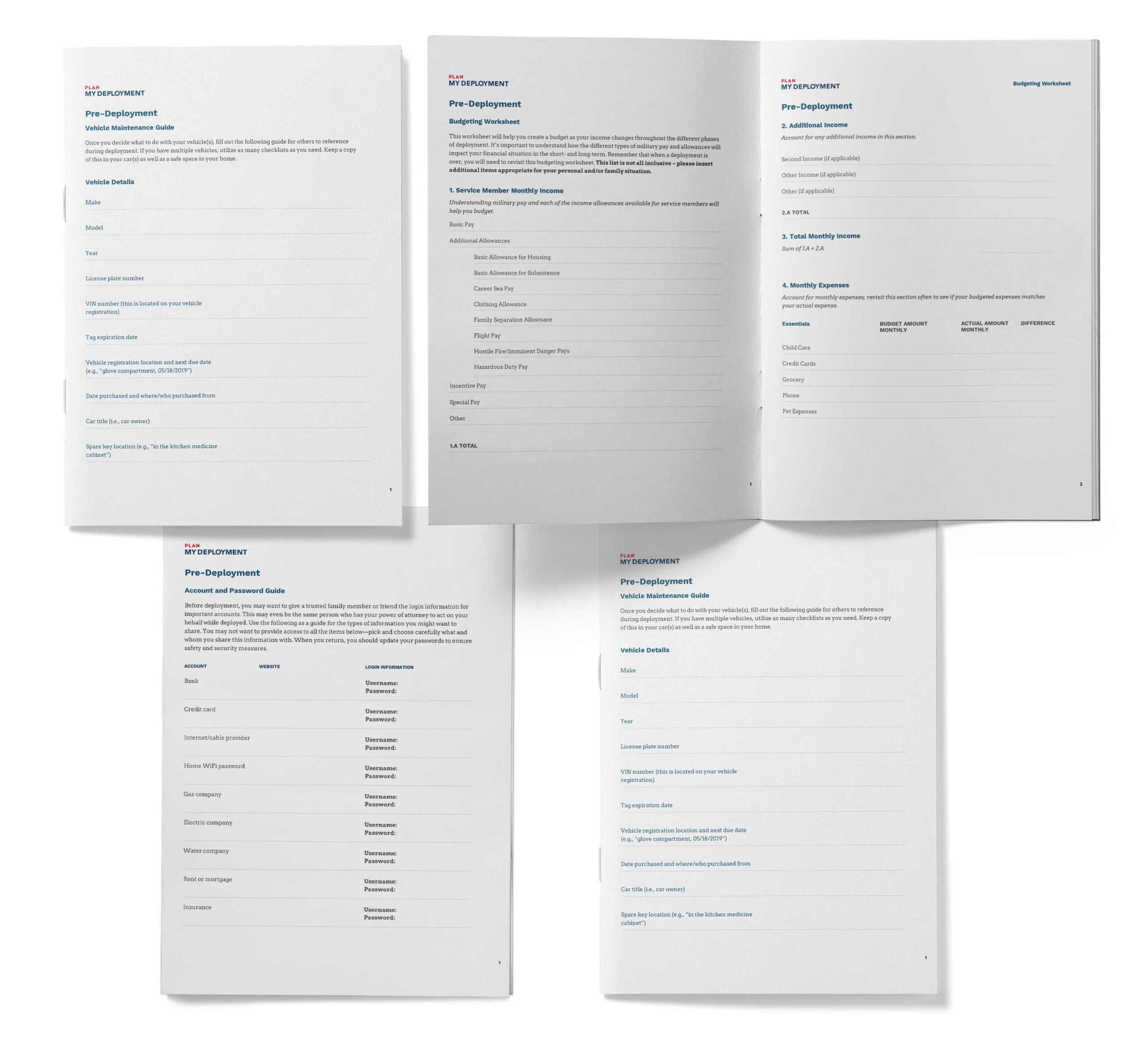
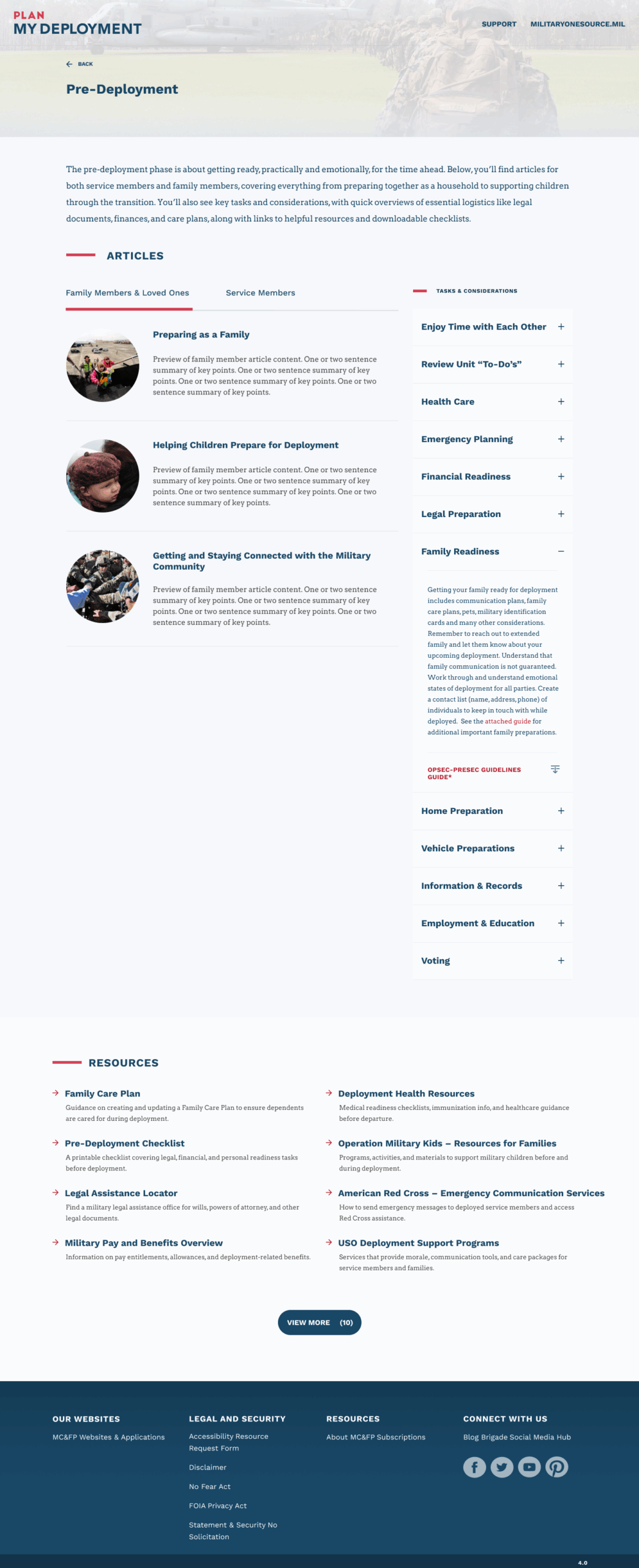
Plan My Deployment: A step-by-step tool for preparing for deployment, connecting users to resources, procedures, and support in one place.
Before, this information was scattered across Facebook groups, word of mouth, or informal chats with deployment leaders. Now, it was all in one place, official, organized, and usable.
The Result
The redesigned Military OneSource ecosystem made the platform usable, modern, and trusted again. By cutting more than 20,000 pages down to about 2,000, we gave users a faster, clearer way to find what they needed. Within the first year, traffic to key services nearly doubled as awareness grew beyond counseling into areas like relocation, tax, and spouse employment. During beta, user feedback showed a 20% increase in satisfaction, with service members reporting that the site was easier to navigate and more relevant to their needs. The new tools, Plan My Move and Plan My Deployment, began gaining steady traction, especially among families preparing for relocations and deployments. Combined with the refreshed brand identity, Military OneSource was repositioned as a modern, trustworthy, all-in-one support hub for more than 10 million military members and families.
Contact me
© Zeinab Mohtadi 2025 | Digital Product designer, UX/UI
Email: zmohtadi@gmail.com
Linked In: in/zmohtadi
Dribbble: dribbble.com/zmohtadi